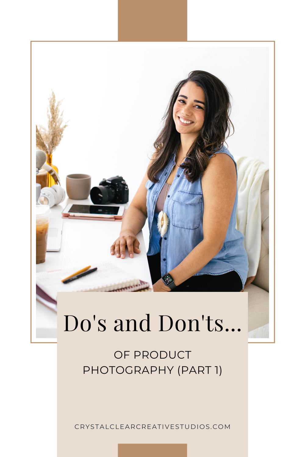
Product Photos – Do’s Don’ts (Part 1)
Product Photos – Do’s Don’ts (Part 1)
 (4)")
Welcome to the Crystal Clear Podcast where we strive to empower the everyday creative boss to elevate and grow a business that matches your creativity and passion for creating products.
Things mentioned in this podcast episode:
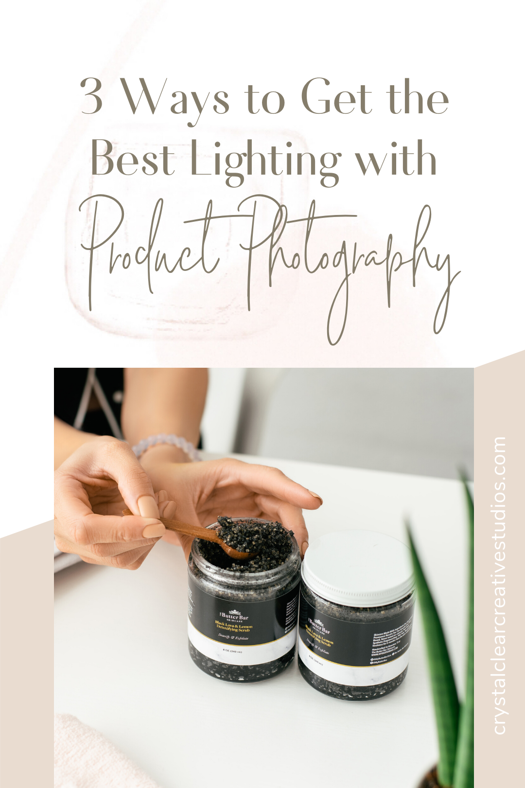
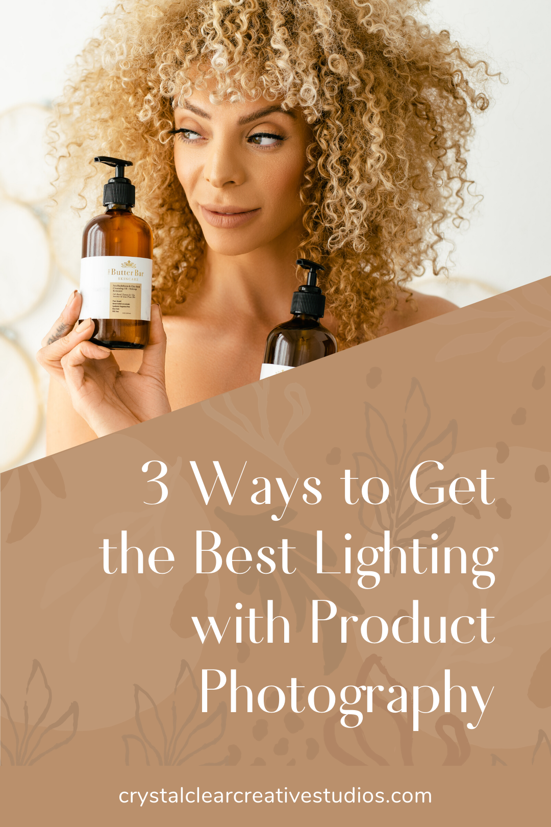
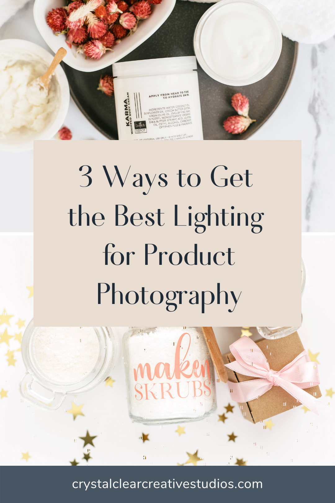
Are you looking to DIY your product photography? I am sharing my top 5 do’s and don’ts when taking product photography. This is helpful if you are trying to take the pictures yourself at home or to help you know what to expect if you are outsourcing your photography for the first time.
Do’s and Don’ts of Product Photography:
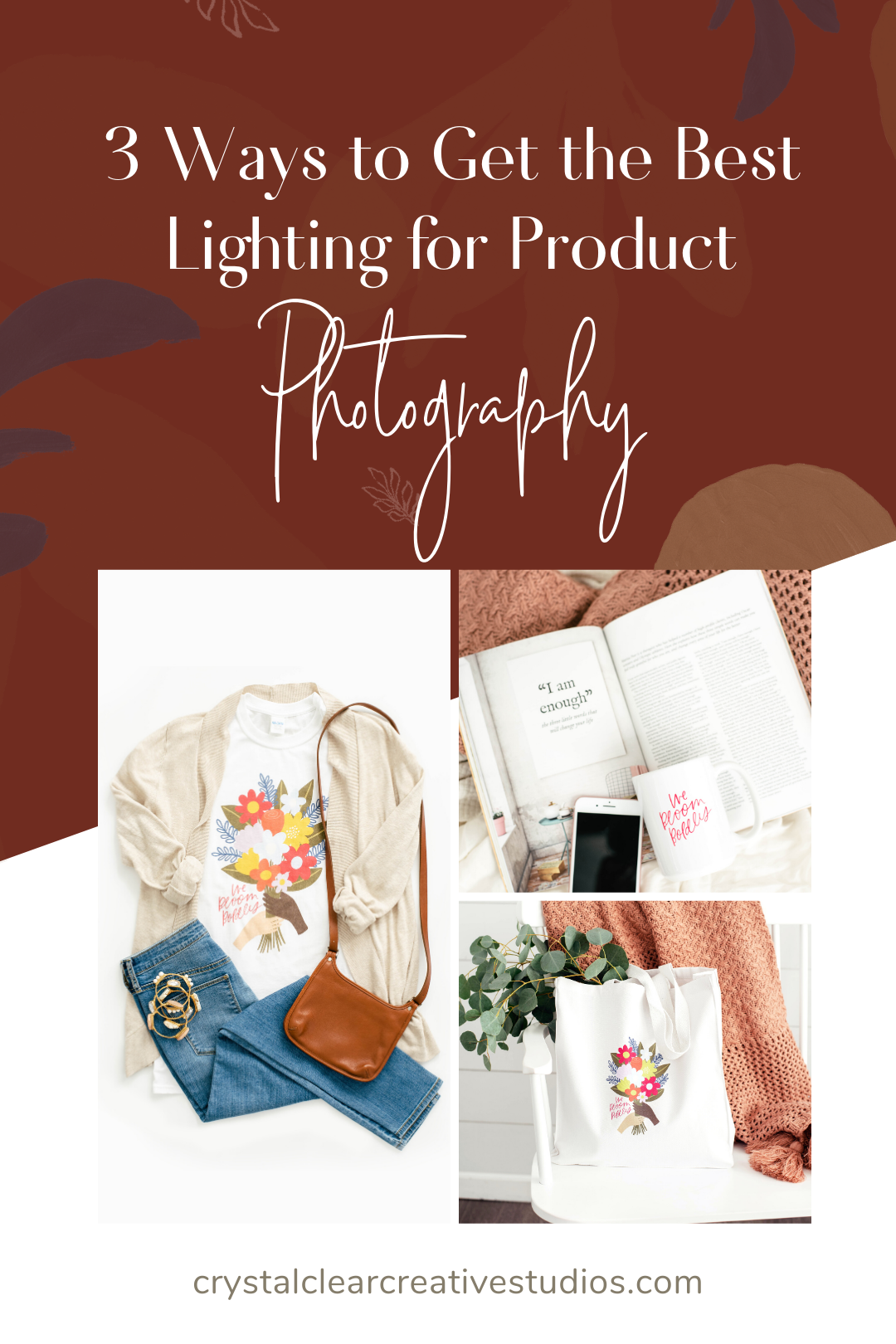
- Do branch out and use more than a white background. My favorite place to go for backgrounds is Stile and Co. They have a wide range of backgrounds that are great for any type of photo and they are easy to clean and store.
- Don’t leave your images unedited. Even if you are just using your phone to take your pictures there are still ways that you can edit your photos. The lightroom app with some presets is a great place to start!
- Do collect props that fit your brand aesthetic. This will allow you to switch things up and still stay on brand. This can be as easy as picking something up from Target that fits your brand.
- Don’t aimlessly pull random things from your home. This will show in your images. Especially if it is something that is used like shoes or make-up.
- Do look for clay and hand made items. Clay is very trendy right now so look for these types of things on etsy or even your local goodwill or antique store.
- Don’t forget to play with your lighting. This could be playing with how the sun hits your window and blinds or by adding dramatic lighting or shadows. This is a great place to start with more education in your DIY photography journey.
- Do incorporate pops of color. But only if it fits your brand. It doesn’t have to be bright or crazy. It can be a subtle pop of color that you use on your website as an accent color.
- Don’t stray from your branding. This leaves your business looking busy, lacking direction and zero consistency. So when you are looking for props and other ways to add color don’t stray from your branding.
- Do refresh your images periodically. Don’t keep your images in a constant loop. You have to devote time to create new images and content in order to keep everything up to date and fresh.
- Don’t underestimate the power of professional photography. Even if it is just one shoot to give you new and fresh content to allow you to have a consistent brand appearance take the jump and outsource it.
Have more questions about product photography? Shoot me a DM on Instagram. I am happy to answer anything for you!
Like this episode?
Comment, share on Pinterest, or even snap a screenshot and tag me on Instagram! I’d love to hear what you think about props for product photography.
Keep Listening
About Crystal

Crystal is the Creative Director, Photo Stylist, and Commercial Photographer behind Crystal Clear Creative Studios. From increased sales, visibility, and trends to conversions and full production, Crystal and her team, experts on the subject matter, provide clients with confidence to take your photography and videography needs off your plate. We support you in your growth with the creation and implementation of transformative ideas.